Let's Talk Turkey

The story: For more than 50 years, Americans have been “gobbling up” Butterball turkey on their holiday tables. The iconic brand is not only synonymous with turkey but it instantly calls to mind a single holiday: Thanksgiving. As a result, consumers have come to directly associate Butterball with the occasion.
The challenge: While Butterball turkey performed well during the holiday seasons, the brand struggled at other times of the year. Because the brand became synonymous with special occasion cooking, retailers and consumers didn’t recognize the brand as a year-round product.
Consumers’ changing lifestyles and eating habits were also a challenge. In the past, families spent time cooking at home and eating together at the dinner table. Nowadays, families are lucky if they’re able to find time to sit together for dinner, let alone enjoy a homemade meal. By noticing and reacting to these changes, Butterball realized it needed to redesign its packaging to be more relevant to consumers today. Moreover, the product’s packaging hadn’t undergone any major updates for six or seven years, causing it to look dated.
The goal: It was time for the brand to evolve. Butterball partnered with Cincinnati, Ohio-based Fisher Design to revitalize the brand and increase consumer recognition of it as an everyday product. The brand was also in need of packaging to showcase the convenience of its products.
The solution: Over a two-year period, the design team conducted consumer research along with a category audit of competitive brands, marketplace factors and emerging trends across food categories to develop a revitalized brand strategy that would embrace consumers’ emotional connection with Butterball, while evolving the packaging’s relevance to consumers today.
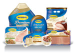
Through research, the team discovered that not only were consumers associating Butterball turkey with Thanksgiving, but they were also linking it to long prep time. While the brand’s whole bird turkey does take hours to cook, it was important to point out that other Butterball products can be ready in 30 minutes or less. As a solution, the design team created product tiers by branding the Ready-to-Roast line and creating the Every Day sub-brand. Such branding allows consumers to clearly distinguish holiday products with long prep times from everyday products with shorter prep times.
As for the brand’s logo, the team kept the oval form with the blue text against a yellow background in order to hold onto brand recognition. To evolve the brand, however, designers changed the font, making it more contemporary, yet still casual and easy to read.
Prior to the redesign, Butterball’s packaging had a symmetrical look to it. Therefore, to give the packaging more movement, the new designs use asymmetrical graphics.
Finally, to get away from the megabrand design strategy the previous packaging shared, the team used the Every Day sub-brand as well as color to denote all-natural claims. The new branding and color scheme also made it easier for consumers to identify the difference between products. New photos of the products also appear on the packaging to express the quality, tasty turkey inside.
The results: “Retailers were very excited about the new design and are very accepting of it,” says Bryan LiBrandi, CEO of Fisher Design. “Both internally and externally so far, everything we’ve heard has been all green lights.”
The brand’s redesigned packaging began appearing on shelves in April and will continue to roll out through 2009. BP
Stephanie Hildebrandt is the associate editor of BRANDPACKAGING. Contact her at hildebrandts@bnpmedia.com.
Looking for a reprint of this article?
From high-res PDFs to custom plaques, order your copy today!


